


Ruota il dispositivo
per visualizzare
le immagini


Ruota il dispositivo
per visualizzare
le immagini
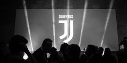
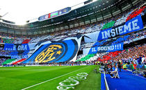
I found really interesting the way a football club recently unveiled its new logo. First, I was struck by the importance given to the event: rather than showing off one’s new vesture, the announcement came as a real strategic epiphany both for the team itself and the league. I appreciated their effort to make sense of, and give weight to, the new graphic sign as if it embodied certain values to be conveyed with a precise modus operandi, as that the logo itself were a rudder, a witness or the north star: a turning point, an intangible indication from there on out.
The presentation of the new logo undoubtedly gratified the graphic designer. It was a just as much a testimony of the work of the designer, or rather the design firm, that oversaw the project (the well-known international firm Interbrand,) as it was to all graphic designers out there, demonstrating that their role is that of interpreting and popularizing the values of a company. Unfortunately, the profession is still viewed superficially, especially in Italy. The press release makes it appear that they went too far; but we know that in the era of the press release being the only font of information, one must err on the side of excess as PR professionals do so well.
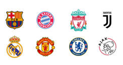
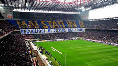
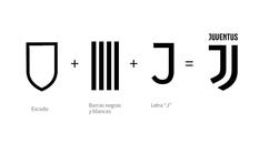
Sandro Scarpa, a blogger and football fan, entitled his article about the event "It’s not a new logo, is the new Juve,” perfectly capturing the whole affair. (Juve being the nickname for the Italian football club Juventus.) I enjoyed the title so much, that I will cite him further: "Last night Juve didn’t unveiled its new logo. Simply put, it revolutionized the way of communicating (visually) in professional football. A logo is the foundation of any brand awareness strategy and it allows for immediate recognition of a company. Juventus has made a giant leap into the future with the logo "J" ( the letter J can no longer be legally used for any commercial use by third parties). In that logo, Juve has captured its spirit, its style, its colors and its winning Italian spirit (...) opening new roads, clear and open horizons. The logo isn’t meant to be liked. It does not have to appeal to us fans. The logo must not be a hyper-imaginative exercise. It’s the centrality of the logo that is truly revolutionary. Distinctive, recognizable, essential. It's a J, and is immediately and only ours. Italian reacted as they always do: the Italian media presented copies, plagiarism, and angry fans who don’t understand it. But what does the new target – the millennials, the Asian market (the logo seems to be a nod to the Chinese character of "Strength" and "Value") – have to say?
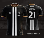
But even Scarpa makes some obvious exaggerations. Is it legally possible to trademark a letter of the alphabet? Or is this only a sign of the delusions of omnipotence typical of football fans? And what is all of this about the logo representing the Italian interpretation of Chinese ideograms? But with similar amenities, the blogger puts forward a number of considerations that tell people just how important a logo is in today’s world. It also shows how the simplicity, recognition, relevance, and immediate impact are the goals of those who propose not to drown in the vast sea of visual identity, which we are subjected to every day by surfing the web, our new, no longer that virtual, home.
And the logo? Is it really as bad as the majority of fans say? At first I was blown away. Instinctively I thought that it looked too much like the logo for a fashion brand; which devalues the value of history and tradition; eradicates both the sense of territory and belonging; which tends to mimic an ideogram proving to be false and all too global. I even found visually unstable, without a real break-even point. There is nothing good about it, in fact. But then, the next day, I saw how it had been applied, replicated, contextualized. Its immediacy and simplicity charmed me, conquered me (I must point out that these are only professional considerations, because the logo, on a personal level, is a major turnoff given that my allegiance lies with the rival football club.) I found it a recognizable, relevant and impactful sign. A sign so sincere that communicates in a unique way some of peculiarities of the football world, such as arrogance and megalomania. In the end, I find it centered, exemplary. Its simplicity has convinced me, a simplicity that really sets it apart from the competition. Will it work? It should, but as always it will be up to posterity will judge (to posterity and the field: it will also depend on how successful the team is over the next couple of seasons).
And talking about simplicity. Simplicity has a contraindication, linked to the risk of unconscious and unintentionally plagiarism. Graphic designers know this all too well: the more you minimize, the more you risk resembling someone else. But today, it’s almost always worth the risk, even with all due diligence.
More and more often, we face the problem of how to give character and personality through simplification. Sometimes simplifying disconcerts the customer (as was the case with the Juve fans). Some tend to reject it out right, interpreting it as a sign of weakness, a lack of creativity. Other times, however, we see the path described above: a progressive understanding, and its appreciation, which soon becomes a sign of trust. I think the progressive assimilation of simplicity is natural, because it proposes to enclose the complexity in a few strokes. Simplicity, which is always the goal of a good graphic designer, is nothing more than the distillation of a wealth of complex data: in the transition from complexity to simplicity, it’s difficult to capture the story of a brand and the prejudices that have accumulated over the years.
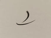
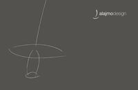
I believe the effect of using simple, but non-trivial signs is similar to that of a simple, but non-trivial piece of music: it can only be understood by listening to it many times, allowing you to metabolize the interweaving. I have witnesses this first hand with the simplification of two corporate logos: the Pinarello logo (a stylized P) and Alajmo restaurant group logo (a stylized J, even if Juvenuts claims to have coined the J). Logos that date back to the early 90's and the dawn of the new millennium, respectively. They both marked a change in perspective, in their respective sectors. In the world of cycling, the situation was like that of the existing football clubs, with a flood of mostly archaic symbols, repetitive and complex. The world of “alta cucina,” restaurant were labeled with the chef’s signature, usually hand-written, with virtually nonexistent logo.
In both cases, the redesign of the logos wasn’t the fruit of a fully shared strategy: I found myself having to contend with two points of view, one targeted towards tradition, as suggested by the parents leading the company, the other innovation, as suggested by the younger generation of the family. So I started by trying to please the children with logos that, in my eyes, summarized some of their character and their desire (to excel, to stand out). In both cases, a long time passed between the proposal, acceptance and commissioning of the executive work of the new logo. At the beginning, in fact, the logos left my clients perplexed. In both cases, the proposed logos were set aside, left to rot, until, after nine months in the first case, after six months in the second, I was told, by their children, it was finally time for something, the watershed marked by the new logo. I was surprised that they brought up what was to me a closed book, but they both needed time to grasp, what I perhaps mistakenly called trust (of a certain time of simplicity).
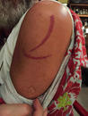
I have become aware of how a logo can influence a company, how it can become a source of identity, or even of pride, for both employees and customers. Having designed corporate logos to then see them tattooed on people as identifying signs, baffles me and makes me proud at the same time. It certainly makes me think. There is no need to go as far as to cite fashion brands: anyone can come up with a strong, identifying sign. To do so, one must start by simplifying. And then simplify again, over time, based on trust and patience – which we all seem to be missing.
23/02/2017 Filippo Maglione