


Ruota il dispositivo
per visualizzare
le immagini


Ruota il dispositivo
per visualizzare
le immagini
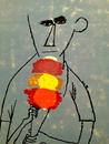
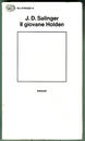
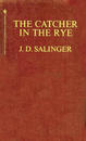
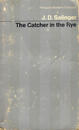
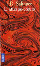
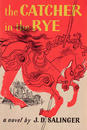
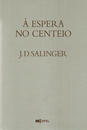
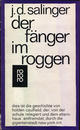
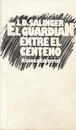
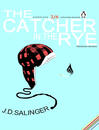
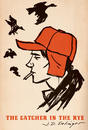
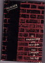
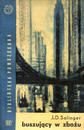
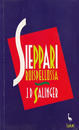
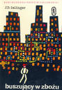
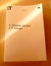
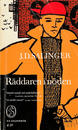
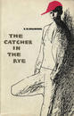
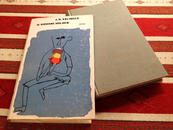
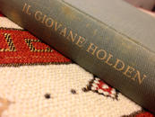
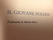
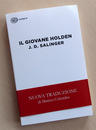
J. D. Salinger’s aversion to the images on book covers, which he considers arbitrary preconceptions, is well known. In spite of this, Einaudi, an Italian publishing house, dared to decorate the cover of the first editions of Salinger’s masterpiece, The Catcher in the Rye, with a remarkable illustration by Ben Shahn. After the author saw the cover, all later editions were given a white cover with a black line framing more white, as if to indicate the absence of an icon, thus underlining that they were forced to remove the image. Over the years the box has disappeared. Now the cover is completely white, in strict compliance with the tastes of the author (except for the always looming blurbs, which he certainly wouldn’t care for).
He was right to demand the image be removed, Salinger. I think that his masterful book, while not particularly long or complex, seems to me to be impossible of capturing in a single representative image of the text or of the main character, Holden.
I have already discussed this problem elsewhere, but realize that as I move forward I give Salinger more and more credit for his radical position: not only in reference to this book, but more generally with regards to all books that try to communicate something “poetic.” And I am sorry to contradict, for once and only in part, the great Bruno Munari, when he says “the cover of a book is a small poster intended to inform the viewer that, in that book, there is something interesting for him.”
If a book is about a precise argument precisely and narrowly or a specific event or a particular epoch, it can certainly be assigned a representative icon to be used as a “poster.” For instant books, for catalogs, manuals, and some essays, no problem: a graphic designer can have fun coming up with a cover. And for bad novels, anyone can put anything on the cover, no problem.
But when someone with a skill, an artist of the word, reconstructs a fragmentary soul (this is what Salinger did and what roughly all great storytellers to: reconstruct with words the souls of their protagonists), how do I represent it, that soul. How do I enclose it in a precise image, without limiting it or betraying it? Or even disturb it?
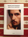
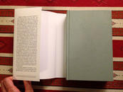
Take, for example, Crime and Punishment (and here length and complexity abound), which I recently re-read. (The new translation by Emanuela Guercetti isn’t the best.) On the cover, they slapped the self-portrait of Léon Bonnat, a big, languid, brooding face of young, noble and austere man. What is his relationship to Raskolnikov? Beauty and thinness? His eyes seem to yearn for an incipient mental disorder, I guess. But I feel that the face imprinted on the cover, that I see even before being introduced to the main character with the written word, take away something fundamental: my pleasure in reconstructing the image of Raskolnikov by interpreting the words of Dostoyevsky's and following the portrait he paints as the story unfolds. I will be influenced by the physical, psychological, and therefore spiritual, portrait selected not by Dostoyevsky, not by me, but by an even praiseworthy publishing house located in Via Biancamano, Turin. It can’t be. It’s a little crime, an injustice that I simply can’t accept. In these cases, I resolve to immediately remove the dust jacket and enjoy it’s characteristic blue-greenish Imitlin cover, which moreover makes the book easier to handle especially in nighttime reading sessions. It is clear that if, instead of the portrait of a pseudo Raskolnikov, they had chosen the reproduction of a painting depicting a glimpse of St. Petersburg in the mid-nineteenth century, they would have caused less damage. But even in this case, why condition the mental reconstruction of the places described? As if the words of a genius were not enough. As if we need help to rekindle our fleeting, visual imagination.
For these types of books, I consider symbolic representations harmful, even the best ones, which seem almost always ingenious or crafty with superfluous and abstract depictions, patterns, decorations, and doodles. The cover of a remarkable book must recall the silence that pervades the room for a moment before the start of the concert. In this silence, my ideal book might correspond to the prière of inserer, or the description hidden on the flyleaf or back cover, or inside. The publisher has to give some information to the potential reader/buyer, but just as long as it’s not forced before your eyes: you should be able to look for, read, and decrypt this text; this is all part of a choice and not an imposition, unlike a work of art, which while beautiful, still camps out in front of your face.
Returning to Salinger and his burrowing away from the spotlight, away from everything. His actions are so in tune with his graphics choices and the love that I have always had for the secluded writers, for the irregular, restless, shy writers, for the geeks. As a boy I preferred them simply as kindred spirits, feeling, like many teenagers, always perfectly out of place. Later, however, I realized there was another reason, more precise and relating to the act of writing. Something that Italian writer Paola Mastrocola describes well: “The writer writes precisely to not revel himself. He loves to stay hidden in the shadows and therefore writes. If this were not so, he wouldn’t write: he would something else. Instead, he writes in order to have a well-protected den. He feels good there. There he exists, but can’t be seen.”
29/10/2014 Filippo Maglione