

Ruota il dispositivo
per visualizzare
le immagini


Ruota il dispositivo
per visualizzare
le immagini
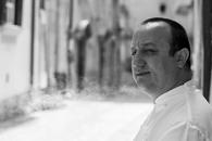
The many projects we carried out in these last months (of which you will find a small selection in the Porfolio section of our website) allowed me some distractions. The arrival of the summer, however, hasfinally granted me a little breathing room, allowing me to return to what had become a neglected custom of writing these so-called “snapshots.” Even if this one is different from its predecessors. In fact, I will present a recent interview of mine conducted by the Italian writer Nicola Dal Falco, which took place during the presentation of one of our recent projects. The questions roused some thoughts, more or less cheerful, regarding our profession, the noble craft of the graphic designer.
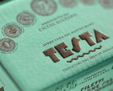
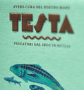
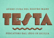
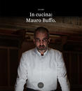
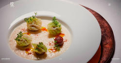
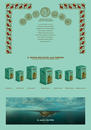
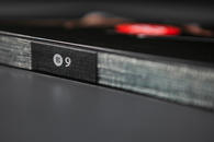
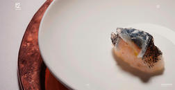
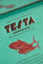
The Testa Conserve project, a message designed to last over time by Nicola Dal Falco.
How is a new graphic design project born?
Esiste un metodo, che si può definire standard ed è scomponibile in varie fasi, che inizia dallo studio del settore merceologico in cui si dovrà operare e che passa attraverso la minuziosa indagine degli obiettivi del committente e la verifica dei loro competitori, diretti e indiretti. Questa fase, puramente esplorativa, è decisiva per la redazione della “Relazione preliminare” in cui vengono indicati i presupposti concettuali e stilistici, da condividere con il cliente prima di svolgere quello che è il cuore di tutto il lavoro: la “Relazione d’immagine”, che è la traduzione visuale di quanto si è definito in precedenza, comprensiva delle bozze dei mezzi principali. Il tutto, infine, viene tradotto in progetto esecutivo da destinare alla produzione (essenzialmente cartacea e digitale). L’ultima fase, spesso a torto sottovalutata, è dedicata all’assistenza alla produzione, per essere certi che ogni mezzo venga realizzato dai vari fornitori (tipografia, cartotecnica, web provider, casa di produzione video…) in maniera conforme ai desideri.
What were the strengths of your project and their applications?
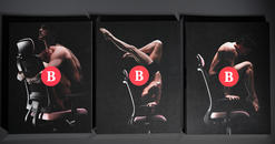
We believe the strong point of this project was its lasting character or personality. The entire project was carried out meticulously from the illustrations were designed by Sicilian artist Giovanni Robustelli to the written copy. We created a visual communication system in which the applications and variations are practically infinite, made up of many individual elements, each characterized and characterizing, with a separate personality. I am referring to the friezes, medals, typographic characters, illustrations, logo and color: each element seems to tell the same story, but from its own point of view. All it takes is the coupling of a pair of these, even if chosen at random, to give life to an original dialogue, making the image always fully characterized and recognizable.
What works and doesn’t in the graphic design field today?
Today information related to the field is easily accessible and that is a huge plus. Thanks to the web, you can easily access the best design produced in the world, practically in real time. This close exchange of information has raised the bar of graphic products. The problem ensues when we try to dig deeper, not designing a simple portion of the image, but trying to interpret the character of a company in an attempt to produce more complete, ramified and original communication strategy. cut to size. In these cases, I believe that there are cultural defects. I speak of culture in the sense of "reading and writing." Anyone who thinks that a good graphic should nourish himself professional only on visual culture is out of their mind. A good graphic designer must know how to read and write. To learn about art, history and science - indispensable knowledge for any good graphic designer - we must read; to summarize the knowledge in a coherent and accomplished image project we must write. The problem is that not many succeed in doing so, while everyone thinks they can. It’s a total paradox. In an age of overeducation, few people are able to think and reason about something slightly complex. I know graphic designers who are believed to be well-educated that are literally unable to read and write sentences with more than two predicates and a dependent clause. It is the slaughter of Twitter - and in this case it’s interesting to note how the web can simultaneously represent a means of evolution, as we have seen it before, and of involution. The gravity of a person, and therefore of professional, feeds above all on their “depth,” and the instrument of depth is language. Rudimentary language forms rudimentary people and professionals, unable to dig below the surface. Words don’t simply communicate, they have meaning. We are returning to the age of verbal communication, even when written. Sentences are becoming increasingly shorter. Like slang, they are often expressions created to be noticed, but without depth or duration. And too often in English, even without real reason. By now we write slogans directly in English: thanks to the exoticism of the barbaric language they seem more and more effective, only to discover how banal they really are once translated into good Italian. This, of the loss of consistency of the Italian language, is a theme with dramatic implications that does not only concern our work and that reconnects to the previous one: knowing many languages superficially forms superficial people.
12/07/2018 Filippo Maglione