Ruota il dispositivo
per visualizzare
le immagini


Ruota il dispositivo
per visualizzare
le immagini
Recently we have been very busy, and productive, here at Helvetika. In fact, we have so busy with work that we haven’t been able to prepare the usual monthly “Snapshot” (but we hope to resume the practice shortly). But it’s not half bad since you can never have enough good jobs or good projects; even if this Italian saying doesn’t account for missing the downtime or more “human” moments that we enjoyed prior to the arrival of unhuman technology. (We are convinced that the confrontation between man and technology is, at best, a zero-sum game, or that technology is as detrimental for man as it is beneficial.) Lacking the time to deepen our discussion of these inaccessible conceptual territories, we therefore simply present some of the work we have done this winter, saving the few readers the usual “Snapshot,” the usual newsletter of exhausting paragraphs based on a pretentious topic. Thinking about it, this may actually be the first, true snapshot (short, swift, sudden) seeing as all the previous ones were long, slow and late.
19/05/2016 Filippo Maglione
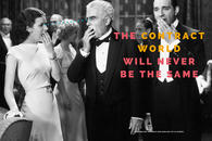
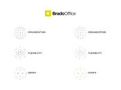
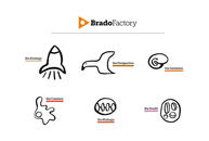
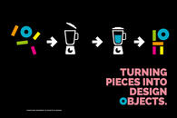
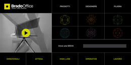
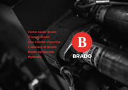
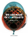
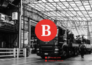
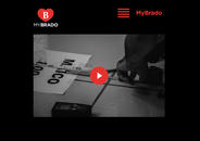
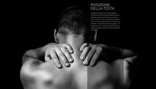
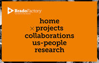
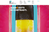
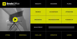
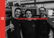
After you have come up with the artistic and design concept of the Brado Contract brand, which was very well-received at the Cologne Fair 2015, we went on to design the general product catalog and company website. Building on the success of this brand, Brado SpA entrusted us with the group's image development and the creation of the artistic concept and design of two other brands, Brado Office and Brado Factory. These are projects that require both rigor and formal freedom, seriousness and irony, precision and imagination. So this is a very serious, yet fun intellectual project that could be better defined as a performance than commissioned job.
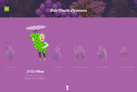
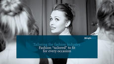
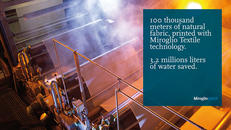
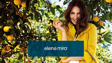
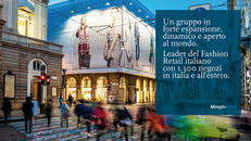
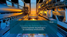
A historic Italian fashion group, among the most important and influential in the world, the Miroglio Group based in Alba (Cuneo), owner of eleven prestigious brands including Caractère, Reasons and Elena Miro, has entrusted us with the development of their corporate image. The job is hard, extensive and profound, requiring us to retrace the group's history to its roots in the 1800s and passing through the years of the post-war boom to define their communicative styles that portray what they will be in the future, based on the company’s investments in the most advanced, smart and sustainable, technological innovation. Given the location of the corporate headquarters, we have also made more frequent trips to the Langhe, a place we love for its literature, as well as its food and wine.
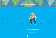
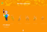
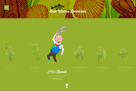
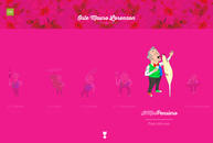
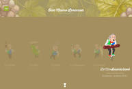
Going from big industrial companies to an individual with a big personality: we have developed the new image and website of “host with the most” Mauro Lorenzon, charismatic and histrionic character of Italian hospitality and food, a real reference point for several generations of professionals working in the Italian food and wine sector. We have created as animated cartoon, in line with the fantastic evolutions that Mauro shows off every night in his restaurant, or in those contexts in which it operates, always with his incomparable touch. (The website is still under construction.)
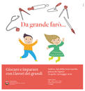
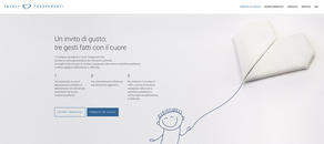
Moving on to non-profit organizations, together with H-Art we developed the image of the "Tavoli Trasparenti" initiative, a branch of our non-profit organization "Il Gusto per la Ricerca," which in eleven (sic) years has collected and donated 1,621,413 Euros to charity in favor of scientific research of childhood diseases. For the University of Padua and UNICEF, we developed the graphic image of a beautiful exhibition dedicated to children's games called “Da grande farò...” (When I grow up I will ...).