


Ruota il dispositivo
per visualizzare
le immagini


Ruota il dispositivo
per visualizzare
le immagini
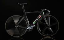
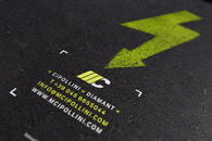
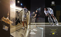
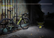
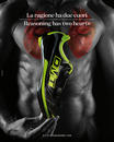
This summer was, according to tradition, the time of the year in which I work the most. We had a lot to do, earning several accolades to boot, perhaps too many (if there was a reasonable exchange rate euro-accolades we could live off the interest). Among our most recent projects, I would like to point out those carried out for Cipollini and DMT (both collections for 2015). Then, there is the corporate image for Caffè Stern, the new glamorous Parisian venue of the Alajmo brothers. There is also the competitive bike company, Divo, for whom we oversaw the gestation period and the global launch. But the work we did for two non-profit organizations was equally as gratifying, "Il Gusto per la Ricerca" and "Gioia Multipla", respectively led by Stefano Bellon and Mauro Defendente Febbrari, two exceptional individuals.
But in spite of all that we accomplished, we still regret not having been able to a couple of jobs that would have been nice to take on for personal pleasure: not to satisfy a professional nee or additional income, but as a sort of sterile aesthetic of selfishness.
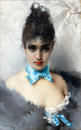
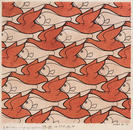
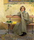
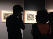
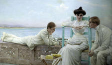
I was wandering around in the now familiar spaces of Palazzo Zabarella in Padua, admiring the masterful work of Vittorio Matteo Corcos, vacuous, cute, impalpable painter, but in some ways compelling, perhaps due to his soft and sublime elusiveness – then again with a technique of the highest order. I was wandering in the semi-deserted halls imagining when I would later, at home, enjoy the faithful reproductions of the paintings on display. Actually, from a certain point onwards, I started to mentally construct my personal and virtual catalog of the exhibition. What works would I highlight, which details to photograph close-up. What font to use, what spacing, which cover, which paper, which back, which dominant color. In my mind, I had already paginated the first thirty pages: a succession of only the eyes of his young female subjects, a string of fifteen double pages of eyes, only eyes, spectacular feminine eyes, sad, serene, enigmatic, sunny, shady, magnetic, soothing … before the title page, before starting the actual book, in thirty pages, with a slight hypnotic effect, able to penetrate the only poignant mystery of an otherwise mundane painter, to the limit of the decorative. I imagined all this was possible because this exhibition aims to rediscover an artist who was an outcast for a long time; an exhibition, thus potentially capable of marking a turning point in his reputation and in the evaluation of works by the artist. It also featured, with justified pride, many previously unpublished works (that would therefore have to be photographed for the first time).
And what did I find in the bookshop? A listless, careless catalog. One with listless, neglected graphics, with listless, neglected photos. Did anyone give any effort to interpret the artist, to feel, to love him, to communicate him? No, just a routine catalog. I asked myself why? Since then what will remain of the exhibit is this and only this?
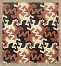
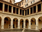
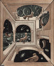
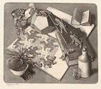
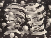
A few days later I was wandering in the equally familiar halls of the Cloister of Bramante in Rome, admiring the original and eccentric masterful word of Maurits Cornelis Escher. It is difficult to leave unscathed, once introduced into his visionary world in which nature, mathematics, magic, pain, play, and even mockery merge into a contradictory magma that is disturbing at times. Here, too, from a certain point on, the eye of a graphic designer took as I began imagining a catalog worthy of such an artist. I envisioned something minimal and well conceived. I imagined neat and saturated reproductions (using a black and white printer in two colors, with the reinforcement of a gray pantone). I imagined a hand-made paper, quite similar to that of his lithographs (Fedrigoni has recently produced an adequate paper, and at a good price). I felt the need of a special binding. At one point I went back to identify the works I would include in the introductory chapter (yes, I like the idea of introducing the reader with an overview of the works at the onset, as if to pay homage to the “best of” his work). Again I mentally constructed the entire catalog, but mindful of the experience in Padua, without feeling any particular expectation for what I would find sooner or later.
And what did I find in the bookshop? A listless, careless catalog. One with listless, neglected graphics, with listless, neglected photos. Did anyone give any effort to interpret the artist, to feel, to love him, to communicate him? No, just a routine catalog. So this time, so as to not suffer the insult of the inadequacy of mediocrity, I reluctantly gave up to purchasing the catalog, preferring to remember the exhibit myself.
Two very different artists. Two different institutions, two cities, two different worlds. But their equal (mis)treatment will always remain as a printed memory. Is just a coincidence, in this ephemeral world?
I still regret not having them made the catalogs myself. I regret not being able to flip through them, not to enjoy them, the two catalogs (two books) that I mentally prepared in the slow journeys to Zabarella Palace and in the Cloister of Bramante. And so I closed a summer full of work (roses) with echoes mocking the verses of Gozzano, reproduced, not surprisingly, on a wall in the Corcos exhibt: "I do not love the roses that I did not pick. I do not love that things that could be and have were not... "
14/10/2014 Filippo Maglione