


Ruota il dispositivo
per visualizzare
le immagini


Ruota il dispositivo
per visualizzare
le immagini
My love of graphic design comes from my love of books. Books intended both as a physical objects and as text, as content. But I think I remember that my first impulse was directed to the object itself, with sheets of ornate typefaces held together by a binding. I still remember the thrill of feeling the relief of the printed character, passing my hand gently on the paper. A large part of my life choices were based typefaces, the fascination I had for them at a decisive age.
As a professional graphic designer, however, I have always used only a few typefaces. I wouldn’t take long for me to list them. I count half dozen, if that. If you see others in my portfolio it is the fault (or credit) of my collaborators. I simply believe that there are very few perfect characters. Perfect for my idea of graphic design, my idea of beauty, of course. They are personal opinions, nothing absolute. Even if rationally there are plenty of reasons to list the positive qualities of the characters I have chosen, and the evils, often severe, of the ones I have rejected.
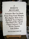
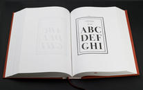
There is no need to mention Helvetica, the word alone is enough. But there is another character, in some ways opposite, which I love more or less the same way; a character that has become a legend and has a beautiful name: Bodoni. Unlike Helvetica, it is not a perfect character. When printed (or read) small, a grace that is too thin, especially in relation to the vertical axil. It also has a certain stiffness, offset by a wonderful grace for openings, soffits and connection points in a workmanlike manner. It is therefore an inconsistent, defective character. It is almost as if its incomparable beauty of the whole had made it a little too campy, chilly, lazy. It should be used in specific situations, therefore, with all caution, especially when one is forced with small spaces: in this case, it is to be used in less extreme versions, which favor a more consistent grace that comes close to the original Bodoni, since that in the era of the movable type certain exaggerations of proportion were inadmissible. The recent versions leave me perplexed for their fine grace, improvidently exasperated by digital designers.
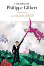
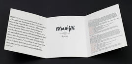
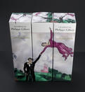
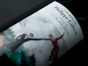
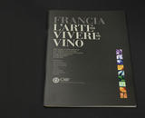
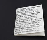
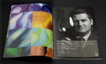
Recently I had the pleasure of working with Bodoni three times. Strangely, and quite unintentionally, always in the wine field. Which is puzzling because there is no character less linked to inebriation and warmth. But I think that the stimulus to use it came from the aim of creating balance. In the first two cases this is a reasonable justification: my work for Massi Fitti of the Suavia di Soave winery consisted in elegantly balancing bold lettering with a brush textured paper. We opted for a less rigorous Bodoni with slight movement (ITC Bodoni) for Philippe Gilbert Champagne. The more austere character (linear Bauer Bodoni) stands up to the "rational and elegant" work of Chagall's "The Promenade" on the label. The hand of the girl launched into the air seems to cling to the dead serious frown of Bodoni. In this case, as in the third and last, the image of GMF, or Giulio Menegatti, the most prestigious among the major importers of French wine, the pleasure of using Bodoni was twofold because it was two commissions linked to France. It is always a great pleasure to offer Italian excellence to the French, especially in those fields in which they feel really cool (and with Didot, the typeface, rightly so. There is a known controversy over which is superior, Firmin, the French, or Giambattista, the Italian. For us, obviously, the problem does not arise. We have rubbed our preference it in the face of the French, with pride.)
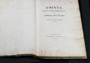
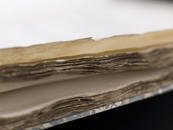
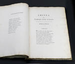
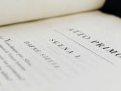
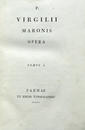
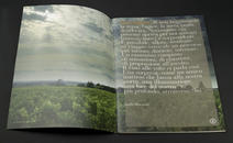
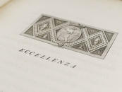
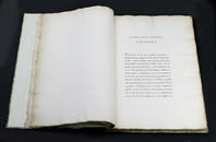
Finally, all I have left is to tell two little personal stories directly related to Bodoni. The first dates back some fifteen years, when I purchased an original Bodoni typeset book, the 1793 edition of Tasso's “L’Aminta.” It was the biggest thrill of my life based on a material purchase (even if in reality such a book is less physical and more spiritual). I still spend half a day rereading the great work of our ill-fated poet laureate, smelling the pages, both sweet and pungent, peering through the thin letters inked to perfection, appreciating the deep black, even the slight stains of handmade paper, the perfect alignments, touching the seals and the press with my fingertips. I am overwhelmed by the immense, monumental margins. I am always amazed by the perfect alignment that I appreciate in transparency. There is in everything; from physical and spiritual lust, literary mania, ink and paper perversion.
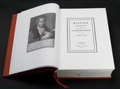
The other emotion is more recent: it occurred during the reading of the introduction ("Giambattista Bodoni to the reader") of his manual on printing, printed posthumously in 1818 by his widow and reproduced in 2010 by Taschen. At the end of a life spent in the service of printing, Bodoni shows his knowledge with angelic precision and proper consideration of self. What I notice is that technically speaking he creates a real "moral typography,” completely lost professional printers today. Using the word "typographer" to describe Bodoni is equally as insulting as calling Johann Sebastian Bach and “artist” on the level of John Allevi or Vasco Rossi. Giambattista, speaking of his (true) art, said:
"The idea of beauty certainly ought not to be confused with those of the Good and Useful; but those, however, are like three different aspects of one thing viewed from three different sides. The printing of a good book is all the more profitable, as it is read by more people, more times, and more willingly, and the more easy it is to read. [...] And the more classic the book, the more sense it makes that the beauty of the characters stand out. [...] But perhaps it is safer to restrict one’s self to say that the letters have grace, when they seem written not with listlessness or haste, but rather with effort and suffering, with happiness and love."
15/02/2012 Filippo Maglione