The new website of the Alajmo Group is online.
When to trust appearances?
“Trust the so-called superficial aspects: the cover, the graphics, the page layout, the title. They are like the sober labels of noble wines. It happened to me; I trusted appearances and blindly choose, discovering in this way authors, books and publishers. Only the superficial, said Wilde, do not believe in the first impressions.”
These are the words of Giuseppe Pontiggia, in reference to the purchase of books. Advice I share with satisfaction, having put it into practice many times. This is how I choose “The Unbearable Lightness of Being” by Kundera, then unknown to the general public in Italy. This occurred the same day that a small battery was tossed in front of the cash register of a bookshop near my office. I immediately suffered an irresistible fascination with the title and the cover. I bought the book sight unseen, without even reading the flaps. I could use it as simple upholstery, I thought. Much the same happened with Camilleri, who I discovered by pure chance, long before he exploded in Italy. I came across “La Stagione della caccia” (a masterpiece), sitting there among other books published by Sellerio; there was only one copy, totally anonymous, even a bit worn. In this case, in addition to the title and the image on the cover, even the flap intrigued me. In order to understand just how unknown Camellieri was at the time: immediately after reading it, I went back to library to hunt for other books by the author, and I had to order the only one available from a catalog. Two exemplary cases.
There these two examples have something in common: my almost unconditional confidence in the respective publishers, Adelphi and Sellerio. A trust that is placed also in the appearance of their books, an openly recognizable and unmistakable appearance. Books, physical objects, such as real brands from a factory. A bit like, to make a comparison risky, a Porsche, recognizable for its sleek, unmistakable and durable cars, rather than the complex symbol of the prancing horse on a shield, which is the true representation of the brand.
On this basis of what Pontiggia said, in addition to a well-written article by Giovanni Lussu in the July issue of Progetto Grafico, I retuned to thinking about publishing and problems related to the interventions of the graphic designer in the purely editorial field. Actually, I have been thinking about this for a while, and always with apprehension, because to see the hand of graphic designer scratching at the window displays and shelves of bookshops makes me always feel uncomfortable, at times sick and other truly disgusted. Wrong covers abound. I stop to analyze works of fiction, which seem to suffer most from this problem. Look at them: ranging from portraits (preferably of a beautiful girl) repeated obsessively, in tireless effort, I think, to perpetuate the centuries of incomprehensible success of “The Solitude of Prime Numbers,” to the jumble of shapeless graphics and photos poorly overlapped (and paintings and lamination). It is an attempt to use fireworks to conceptually represent a plot in a comprehensive manner, so to speak. It must be from the pneumatic vacuum of ideas, where all one has to do is recycle a series of bad ideas. What makes me uncomfortable, always, is to clearly see the hand of a graphic designer. And this discomfort increases when the cover seems to have been made in a workmanlike manner. That is to say, when would be considered state of the art ... if only it were a cover of a book. Why this apparent contradiction? Why does well-crafted book cover made by a skilled graphic designer practically never works in my eyes?
I could easily respond with a few more questions. These. Why are the most beautiful covers, those which all we have all memorized and that immediately communicate an authoritative message, in keeping with the status of the respective publishers, not created by professional graphic designers? Why are the concepts behind Adelphi and Sellerio covers, for example, created by people working for the publishing house and not graphic designers? And these questions implicitly reveal the secret, which I would like to discuss in some depth.
As Lussu says, “book covers have become ‘normal packaging,’ just like soap or frozen food.
The commercialization of the book also involves the dominance of marketing men (and women) who work in distribution, whose limits and prejudices irrevocably determine each choice. But a third observation is crucial: if the potential reader is not illiterate (which would be a nice paradox), all that would be necessary to print on a cover is the author’s name, title, and publisher, and other essential information on the side. Many covers, even covers with beautiful illustrations, have little to do with what is written inside the book, because those who produce the image rarely read it. And even if you read (and understand) it, you can ask why would one overlap another interpretation, which may unduly mislead the reader.”
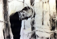
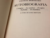
I agree with the words of Lussu, with only a note against last remark, which implies that any "interpretation" of the cover can be misleading. Instead, some cover art designed by publishers (clearly not common, clearly illuminated) works wonders and even offers a sort of opening of visual horizon, as well as a archetypal foothold, an additional key for understanding the mystery of the text, or even an author. What comes to mind, just to cite a number example, are the covers of the autobiography of a beloved author, Thomas Bernhard, masterfully illustrated by Spilliaert paintings, tangles of trunks and dead branches that are an iconic symbol not only to the writing of Bernhard, an endless, repetitive jumble of phrases, but of his in his own life, from his youth to lethal lung disease (a the tangle of dead branches similar to his bronchial tubes).
An editor who viscerally loves books, not just as a source of profit, but just as the highest form of human expression, has an interpretative ability unknown to the graphic designer, due mainly to his respect for the sacred object. For him a book will never be just a "commodity," but a symbolic representation, while concrete, of goods with the high moral content.
I think it is exemplary to hear Calasso explain why he choose the cover of a book published by his publishing house in order to understand what are the pieces in the game at the top level: "What should be the picture on that cover? The opposite of ecfrasi - I will try to define today. Of course we never said anything like this,but we acted as if we understood. Ecfrasi was the term used in ancient Greece, to indicate that the rhetorical procedure of putting works of art into words. Now, the editor that chooses a cover – whether he knows it or not - is the last and most humble and obscure descendant in the lineage of those who practice the art of ecfrasi, but this time applied in reverse, attempting to find the equivalent of a text in a single image. Therefore, for more than thirty years, Foà and I have examined, by trial and error, hundreds and hundreds of images, formats, and background colors."
It almost moves me to think of Calasso and Foà performing a job so familiar to me; it is an image that gives my job new nobility, instead of seeing it as a downsizing of our professional role (to be clear because their work is often done by amateurs rather than hundreds of professionals, even highly rated one, casting a shadow, it is useless hide it, on our profession). And by the way, and to continue to inflict self-harm: Adelphi should mention the choice of composition in Baskerville, is not due to any designer, which has made works by the Italian publishing house far more readable.
In short, the relationship between the professional graphic designer and books seems undermined by a lack of culture in relation to the subject; a subject that requires not only knowledge and application, but devotion, absolute passion, and love. To hear this from a graphic designer is in fact inappropriate. He applies his own culture, education and knowledge to the book, in the same way as when he applies it to other type of object, not succeeding in understand that this is still not enough.
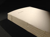
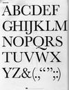
Finally, I admit to have succeeded during my career in producing something that is close to my perfect book. A self-published book of course, of small size, and with virtually no cover and with a primordial and rudimentary binding, very precarious, with visible thread: the essence of the book as an anti-commercial object, the opposite of a product for sale, of soap or frozen food. Only black Bodoni font printed on white paper. The appearance, so thought out, tends to describe the thin and precarious content, with deep humility (perhaps only apparent?). The meaning almost disappears in the presence of meaning. I think Lussu would approve.
08/11/2012 Filippo Maglione


