


Ruota il dispositivo
per visualizzare
le immagini


Ruota il dispositivo
per visualizzare
le immagini
Recently, in a meeting with a potential new client, while we were discussing how to characterize, in terms of image, a brand with claims of durability, I happened to think about how, over the past years, how we fall victim to fashions, i.e. all of those pressures also known as trends.
Regarding these words, trend and fashion, I always found the classic presentations of seasonal collections offensive. Thanks to these presentations, we are made aware about the colors that others have chosen for us ("the fashionable-colors for next fall will be...") and during that pre-established period of time we must like these colors, if not simply because they will show up everywhere.
The trends can be divided into larger categories. They can inhabit different worlds and change how the general public perceives them with great plasticity (plasticity in the illusory sense, meaning the ability to create a reaction that in practice does not exist) and frenetic speed. Today it’s physically impossible to follow all the trends. Therefore, from our small and limited observatory, we just explore them from time to time without necessarily following what industry sectors have invested it. We do so with a mix of serious and skepticism.
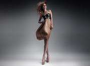
Recently, for a new client in the design industry, we had to study the fashionable-colors, or the color trends for the following year (2016) in the world of interior design. At the same time, for a longtime client, we studied the fashionable-colors in the world of sports. We found that certain correlations exist between the two worlds, for example, in relation to soft tones. The tones are however conceptually motivated (so to speak) and are simply the result of the boring and evergreen principle of alternating strong colors with more muted tones. This is nothing new, of course, and nothing particularly limiting. However, the feeling that this is all a bit of a stretch is quite strong and a tad embarrassing. All of this isn’t even presented as a marketing ploy, but simply as a natural fact. These are the colors and that’s it.
Speaking seriously of the future, a couple of years ago I had the pleasure to attend a conference organized by Whirlpool in Paris in a real "research laboratory of future trends”. This is one of the most respected trend think tanks in the world, able to predict the trends of the next ten years not only in terms of colors, but materials, how products are used, how we use our time at work, and how we occupy our time free time. I was amazed by the seriousness and depth of said research, even if I only had limited access. I found it disturbing to watch a serious and reliable person browse a huge, carefully constructed catalog that presents "that from which men and women will be attracted to". But, as I remember, their trend forecasts were based on certain political-social assumptions (the expansion of the Russian and Chinese markets, for example, or the timespan of crisis in Europe and the US, the recovery time of the South American markets...) that aren’t playing out as anticipated or at least not in the time allotted. So, obviously, in the meantime will have to update the forecasts, which will soon after have to be updated again with regards to other events and so on and so forth.
Returning to the present. All of this brought me back to the famous lesson of Braudel on the differentiated speed of historical movement, that distinguishes "surface ripples", those we perceive immediately in the everyday life (the events of the day, so to speak) from "slower and deeper historical movements", which isn’t easily understood and reveals itself over time, such as economics, modes of production, the feel and the sensitivities of the masses, or scientific revolutions.
Creating a constructed (or semi-constructed) parallel between Braudel’s criteria for reading history and our professional criteria for interpreting the dynamics of style, I would compare the "surface ripples" to so-called fashion trends. Something that acts immediately and appears to us as history, as our lives, but is actually totally superficial and therefore ephemeral; a kind of uncritical imposition that won’t last.
Instead I translate those "slower and deeper historical movements " into attention and understanding of the history of thought, art, culture, civilization, and elegance. A social history that forms a radical plot with a slow place, reconsidered and reformulated continuously, without coercion of any kind.
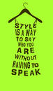
When developing a new corporate image or product, I have little desire to flip through contemporary graphic design magazines or visual communications manuals, which with all of their distortions and aberrations, are able to express what happened and what will happen, rather than illustrate the world for what it is. In order to create a lasting project, something that won’t appear old very quickly, I must distance myself to a certain degree from the facts of the day, from the “surface ripples”. Fashion, as we know, dies young, and those who marry the spirit of the times will inevitably end up a widower. Our goal is to create something that lasts; that our work, to the extent possible, resists over time. Plausible or utopian as it is, I consider it the best of goals.
I also need to distinguish myself in terms of graphics and content. And I must present this difference forcefully because it’s no longer commonplace; it’s no longer trendy. I’ve been ousted for some time mow from an aesthetic of excess based on show and speculation.
20/01/2015 Filippo Maglione